 |
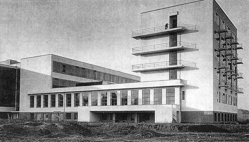
| The Bauhaus building in Dessau, where the school was located from 1925 - 1933 |
As a
graphic design student Bauhaus is most certainly my favourite art movement.
It’s the base of our design process and education and still influences a lot of
our design decisions and styles today. The simplicity, attention to detail, and
the balance between form and function is a source of inspiration that exerts a
lot of influence on all our projects.
Walter Gropius founded the Bauhaus school in 1919. The building was founded with the idea of creating a ‘total’ work of art in which all arts would eventually be brought together.
Walter Gropius founded the Bauhaus school in 1919. The building was founded with the idea of creating a ‘total’ work of art in which all arts would eventually be brought together.
The
Bauhaus was a social idealism that joins with commercial reality. During this
time a lot of new things where being introduced and the instead of rejecting
such changes, the Bauhaus welcomed the new ‘machine age’. It was a phase where
art met with industry.
The Bauhaus name is often associated with the saying “less is more” (Time Magazine, 1954), which contrasts heavily with early print advertising style, as early print ads often featured little to no white space and with often too much information or imagery. Functionality is critical in Bauhaus design, and their school did not believe in including imagery without reason (DesignHistory.org, 2010).
The Bauhaus name is often associated with the saying “less is more” (Time Magazine, 1954), which contrasts heavily with early print advertising style, as early print ads often featured little to no white space and with often too much information or imagery. Functionality is critical in Bauhaus design, and their school did not believe in including imagery without reason (DesignHistory.org, 2010).
 |
| Poster for the 1923 Bauhaus Exhibition in Weimar, 1923, by Joost Schmidt depicts type related to the event combined with geometric shapes forming a cross, with the Bauhaus logo included. Typefaces are all upper case and all elements are on a tilted axis. The hiearchy position of the shapes and type directs the viewer from the top, Bauhaus, down to the year 1923, and then up to other details. |
It is
noted that prior to the introduction of the Bauhaus, there was really no real
concept of graphic design, only layout. People did not necessarily view type as
an element of design, and type was often viewed as secondary to the imagery.
The Bauhaus began to utilise type as an element of design, and not just an
afterthought (DesignHistory.org, 2010).
One
of the major innovations the Bauhaus was responsible for was the utilisation of
sans serif fonts. Prior to the Bauhaus, san serif fonts were not widely used
and type was usually only utilised as copy and not respected as a design
element.
 |
| Foto Qualität, Laszlo Moholy-Nagy, 1931 |
Laszlo
Moholy-Nagy was an important figure in the Bauhaus development. The most
important aspect to him was clarity and that the message communicates well with
the viewer (DesignHistory.org, 2010). His designs aimed to be functional. He aimed at using type according to its
weight, as well as using rulers, dots, arrows and colours, especially red to
emphasise, separate and connect the information laid out on the page. He also
created photographic collage pictures called ‘photoplastics’. For him these were superior to painting. This
influenced the design of the Bauhaus with its intense form, absolute clarity,
and distinctive visual identity.
 |
| Laszlo Moholy-Nagy, photogram, 1922. Light itself becomes a malleable medium for generation design and form. |
A
typographer who was part of the Bauhaus by the name of Herbert Bayers was one
of the most important figures in the development of this new iconic style. He
developed many of the famous san serif typefaces that came out of the era
(DesignHistory.org, 2010). In 1927 he created the famous Universal typeface,
which combines uppercase, and lowercase letters without the use of serifs
anywhere in the typeface. San serif fonts are often used today in advertising,
as they are visually appealing.
 |
| Universal Typeface, 1925. |
 |
| Kandinsky's Poster, 1926, by Herbert Bayer. Depicts details relating to Kandinsy and his 60th Birthday, combining photography, type and rectangles. Type is all upper case, and strong bold sans serif. Design elements are on a tilted axis and red and black on a white background. The reason why they would tilt these pieces because it looks more interesting to look at than if they were simply on a horizontal and vertical grid. |
The
last director was Mies Van der Rohe, 1930, whose main contribution in graphic
was the use of the Grid and sans serif typefaces.
Very
few design movements have had the lasting impact, which the Bauhaus has had. In
the modern world of advertising, the Bauhaus’s emphasis on copy and type and
function of the overall design is still prevalent. Designers are constantly
utilising type creatively to keep their advertisements interesting.
In a
world where so many things are vying for our attention, creativity and
functionality are key. Advertisers must strive to create media which is not
only interesting but that is also clear and serves a purpose or function. An
advertisement can feature fancy artwork, but if it is not serving some key
function in the message that it is trying to deliver, it could be viewed as
pointless. These ideas were key in the Bauhaus school of thought.
Bibliography
ABDUZEEDO, 2013. Bauhaus Influence. [Online] Available at: http://abduzeedo.com/bauhaus-influence [Accessed 3 November 2014].
DesignHistory.org, 2010. Bauhaus Origins. [Online] Available at: http://www.designhistory.org/Bauhaus_pages/BauhausOrigins.html [Accessed 3 November 2014].
DesignHistory.org, 2010. Graphic Design at the Bauhaus. [Online] Available at: http://www.designhistory.org/Bauhaus_pages/GDBauhaus.html [Accessed 3 November 2014].
DesignHistory.org, 2010. Typography at the Bauhaus. [Online] Available at: http://www.designhistory.org/Avant_Garde_pages/BauhausType.html [Accessed 3 November 2014].
DesignIsHistory.com, 2010. The Bauhaus. [Online] Available at: http://www.designishistory.com/1920/the-bauhaus/ [Accessed 3 November 2014].
Kitney, A., 2013. The easy guide to design movements: Bauhaus. [Online] Available at: http://www.creativebloq.com/design/easy-guide-design-movements-bauhaus-8134146 [Accessed 3 November 2014].
Lekach, M., 2013. Know Your Design History: The Bauhaus Movement. [Online] Available at: http://99designs.com/designer-blog/2013/08/15/know-your-design-history-the-bauhaus-movement/ [Accessed 3 November 2014].


No comments:
Post a Comment